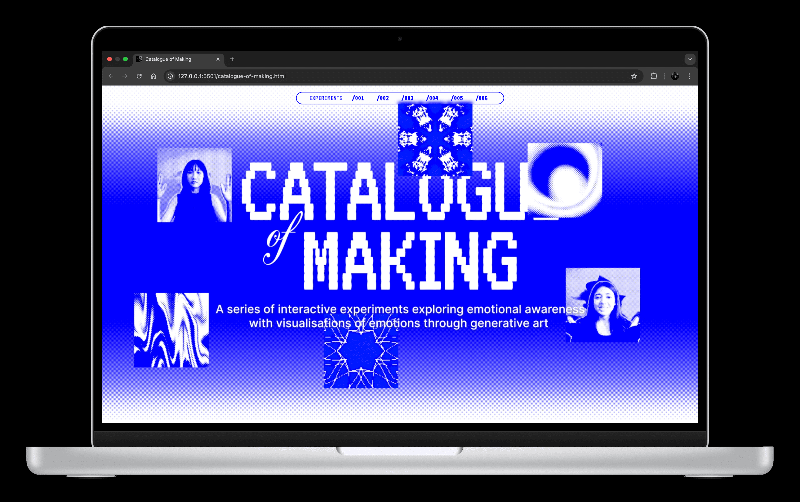
DRAFTING THE LAYOUT
For the Catalogue of Making, I planned to organise my body of work into a single long-scroll website. Since each experiment somewhat builds on the previous one, either conceptually or technically, I wanted the site to reflect that progression in a smooth, continuous flow rather than disconnected pages.
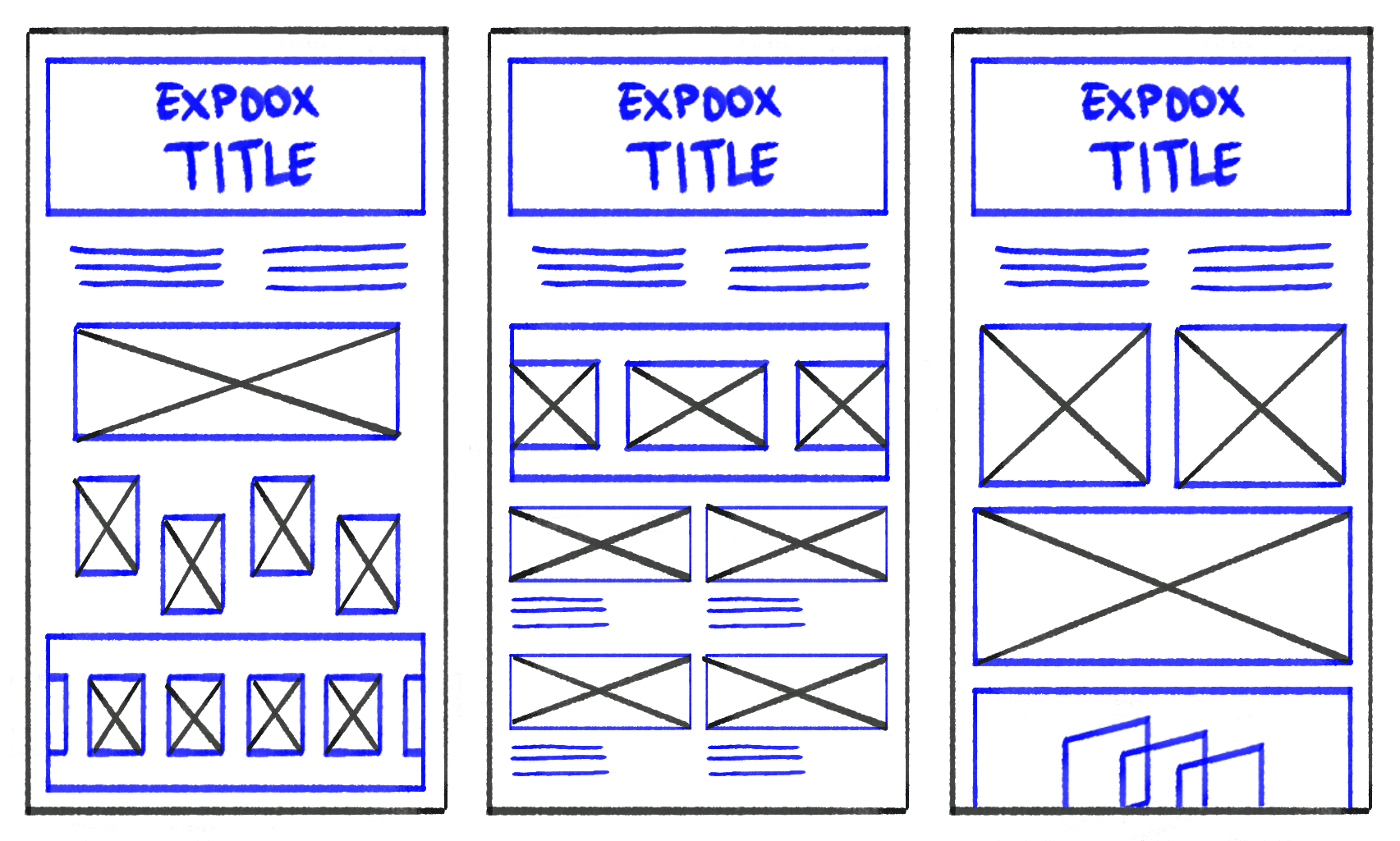
My initial layout was very modular. I wanted to work with minimal text and large images and videos. Each experiment sits neatly within its own section; a column for a written description and the other two-third of the section showcasing the documentation assets arranged as a gallery or in a grid-collage.
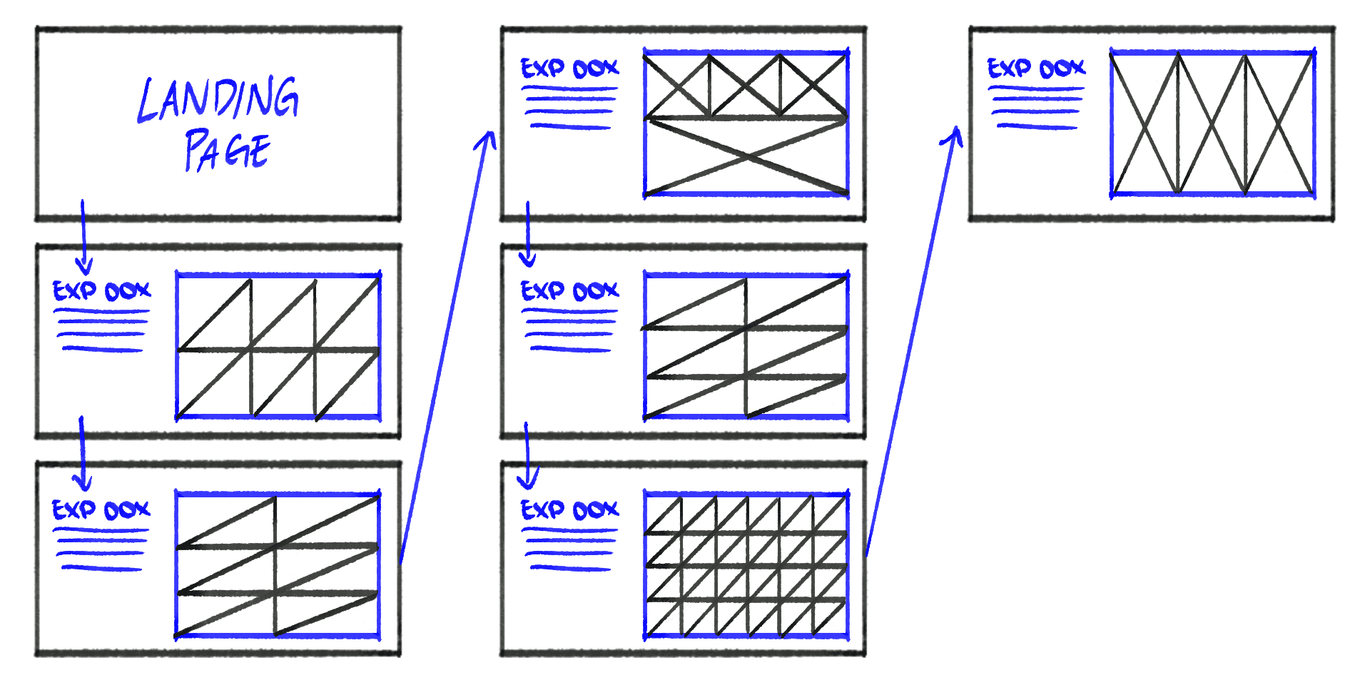
However, once I viewed it as a whole, I realised it looked too much like a rigid slide deck pasted onto a webpage. There was limited visual rhythm and the dense clustering of media would not have done justice to my photos and videos. This pushed me to explore a second version. I separated the documentation assets, such that each experiment will occupy more vertical space and feel more like a chapter than a slide.
In consultation, Andreas encouraged me to space the assets out even more. He pointed out that the layout still lacked ”breathing space” and felt visually cramped. He suggested I think about negative space not as empty gaps, but as intentional pauses. It gives the viewers moments to rest between images instead of being overwhelmed by seeing everything at once. He even sketched a rough layout to help me visualise this approach.
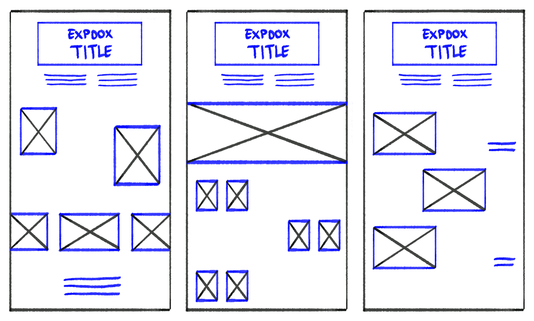
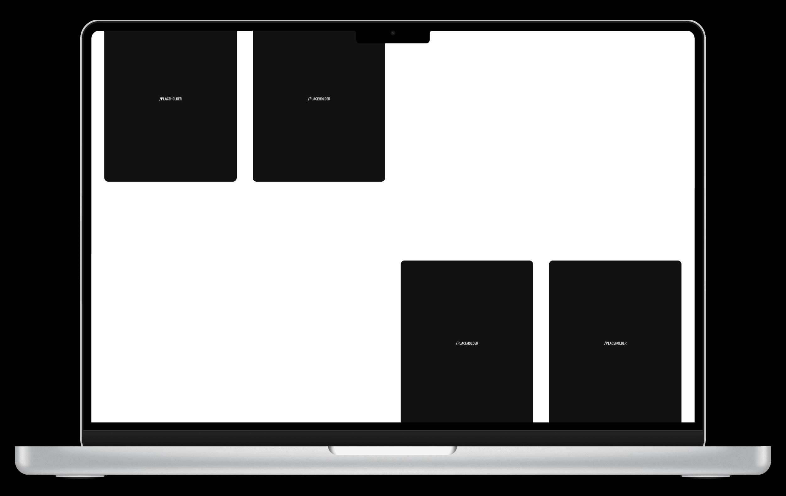
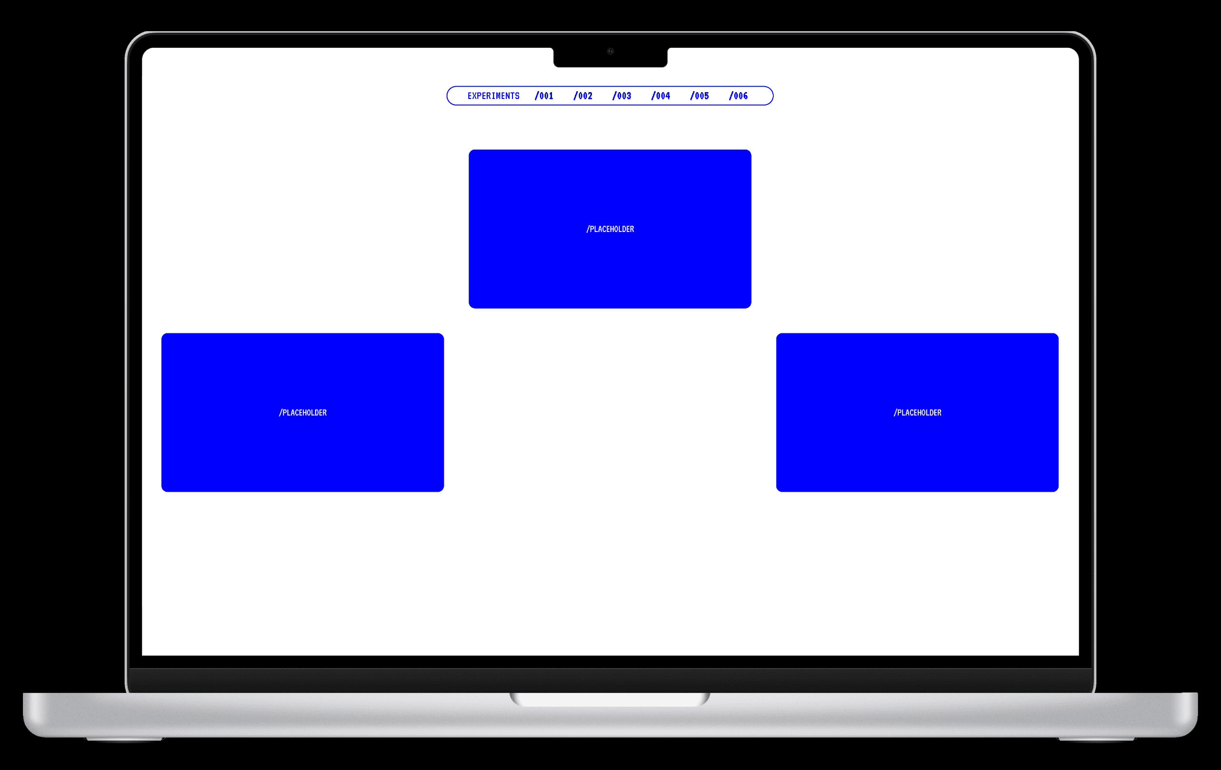
Taking his advice, I reworked the structure again. At first, increasing margins and padding helped create the negative space I wanted. However, the page quickly felt unbalanced and messy. Eventually, I tried using the grid-template-columns, which allowed me to place assets and empty space more deliberately. This grid-based approach finally gave me the clean, breathable rhythm the website needed.

CATALOGUING
As I continued developing the layout, I realised that several experiments lacked the visual or narrative weight needed to fit smoothly into the overall storytelling. This meant revisiting individual experiments to either refine existing content or produce new documentation to strengthen the flow.
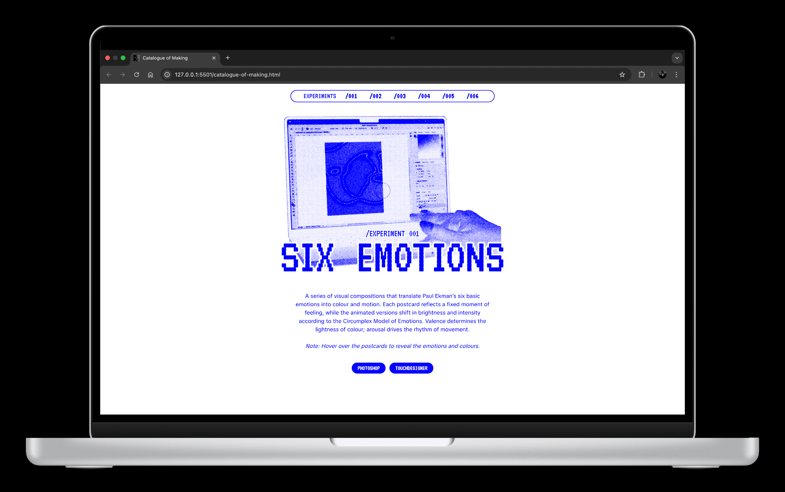
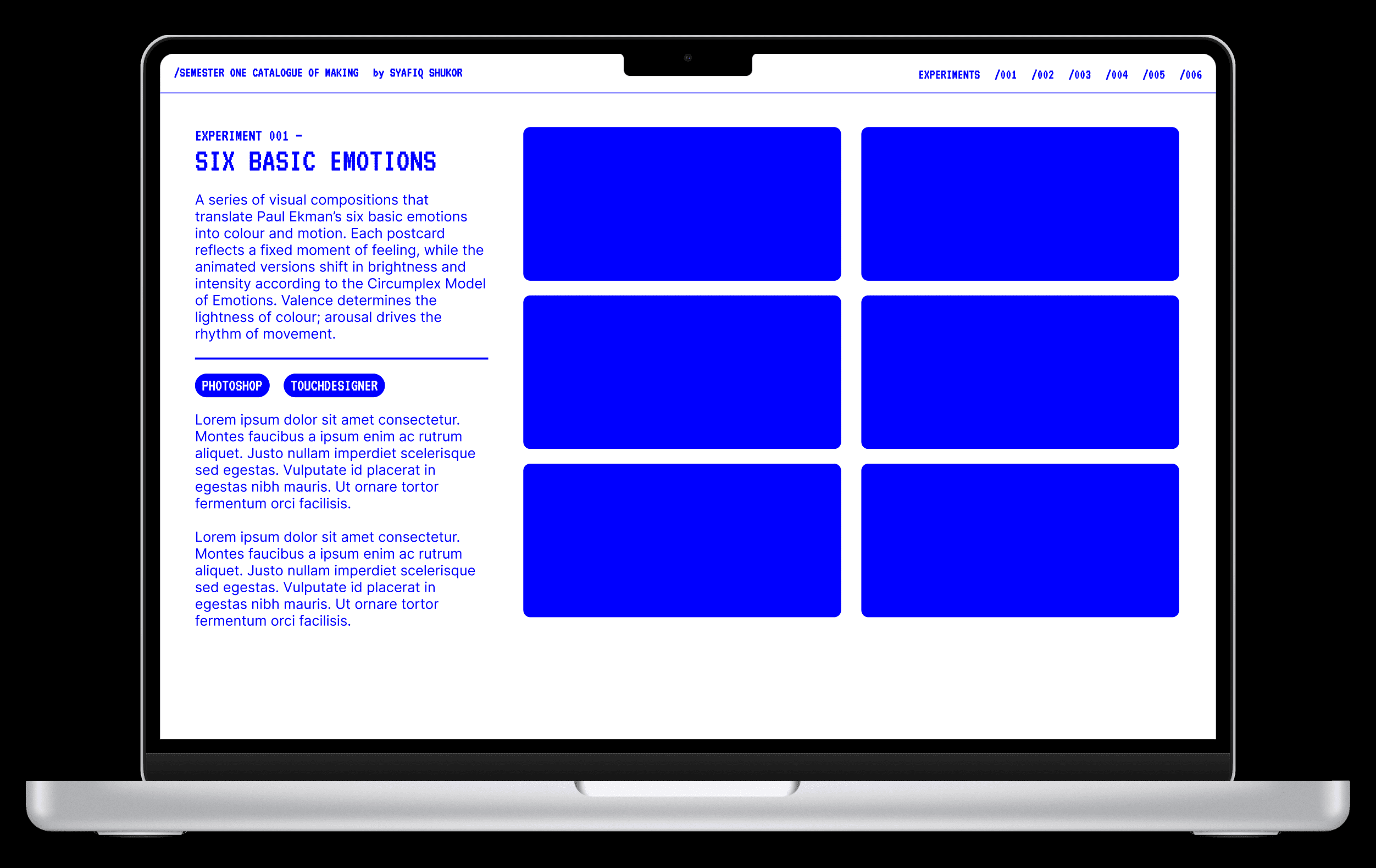
Experiment 001 — I added a video showing how the static postcard was created in Photoshop.
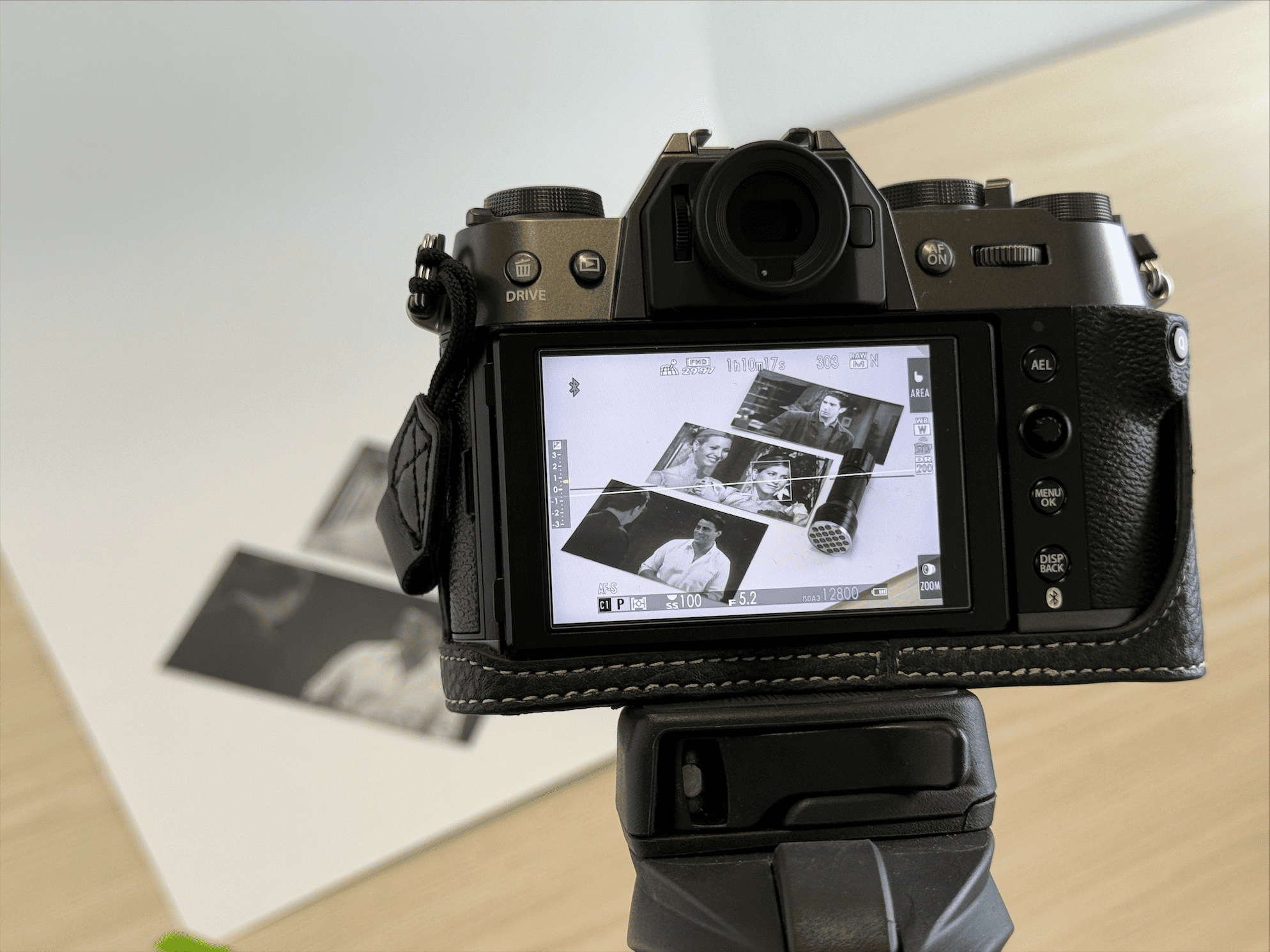
Experiment 003 — The first half of the experiment required clearer documentation, especially since it relied on physical interaction. I shot some photos and recorded a video demonstrating how the invisible ink and ultraviolet light revealed shapes representing emotional states.
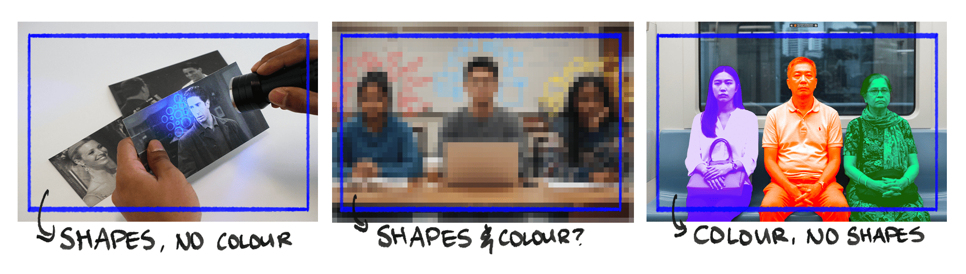
To improve the transition between the tactile experiment and the digital ones, I also felt the need to create a new TouchDesigner sketch that echoed the tactile activity, using shapes as a visual language to express emotions. This added coherence to the shift from shapes to colour-driven emotional visualisation.
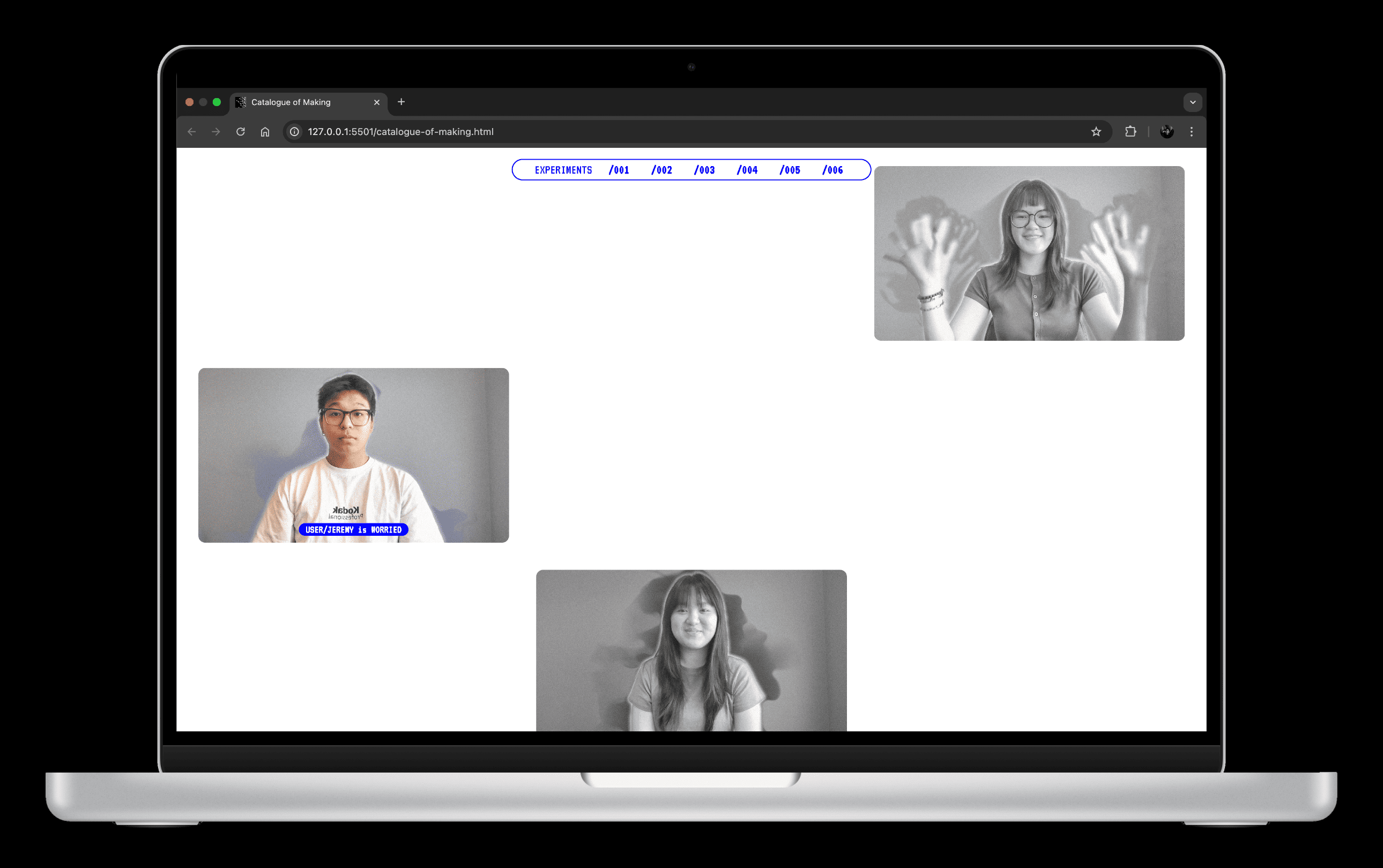
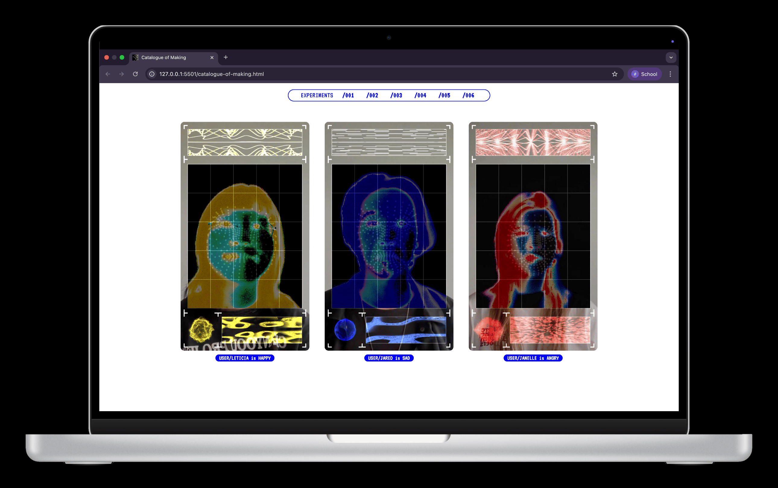
Experiment 004 — I needed to photograph the user interaction with the system, especially since the sphere’s reaction depends on facial expressions. I also recorded videos of two participants demonstrating how the sphere behaves, adding clarity to how the interface functions.
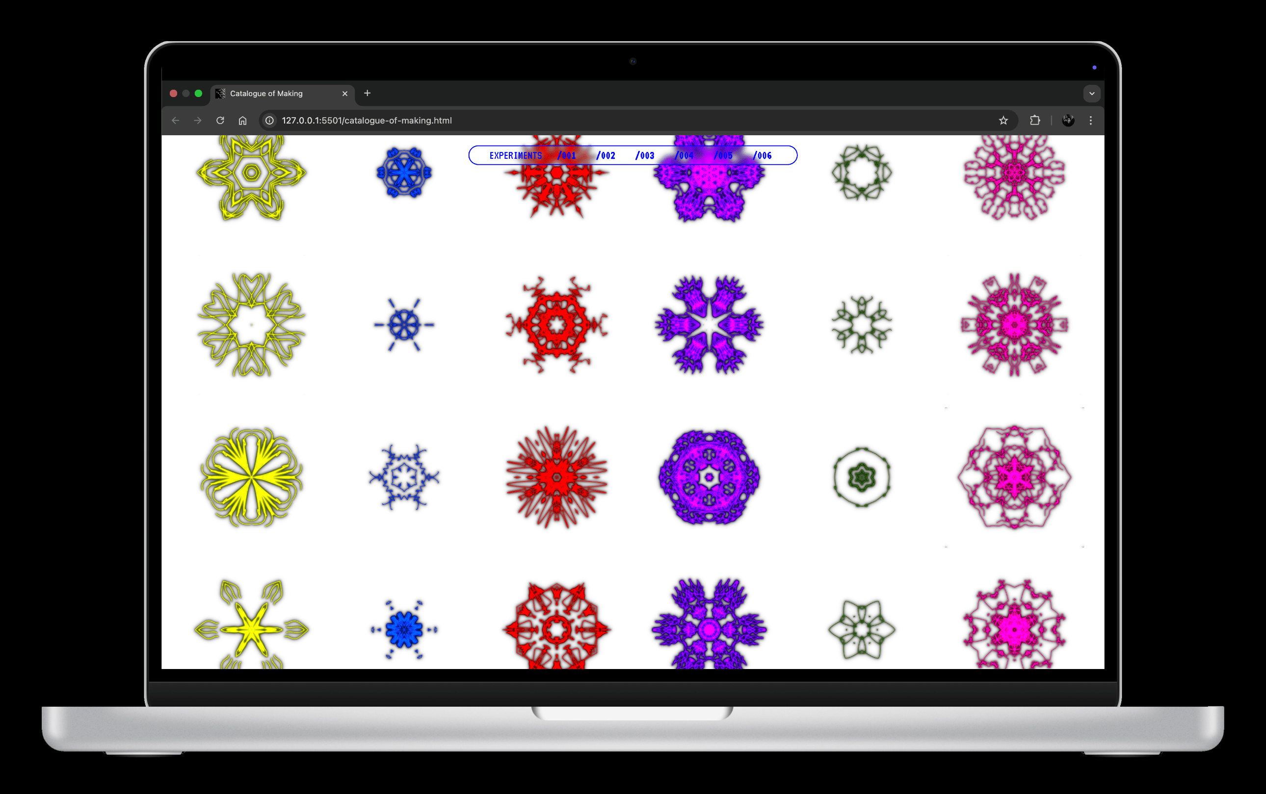
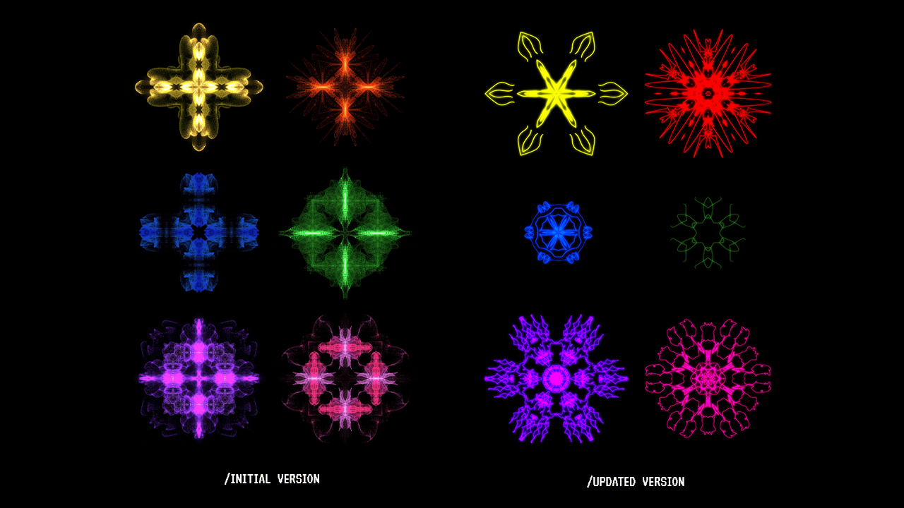
Experiment 005 — The original symbols lacked refinement and looked soft around the edges. I recreated them so that the details were sharper, cleaner and more presentable for the catalogue.
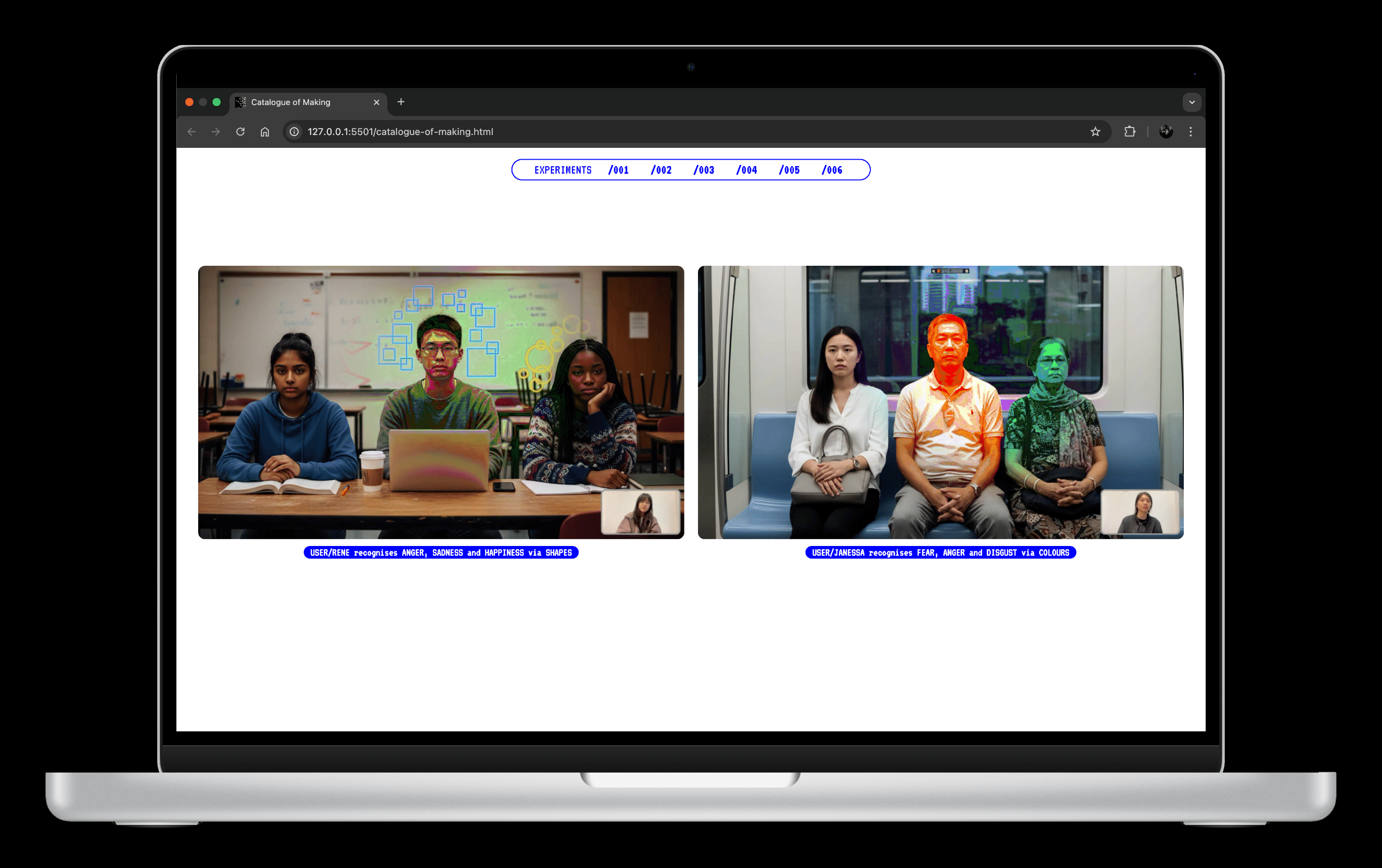
Experiment 006 & 007 — Both shared similar technical foundations, with Experiment 007 simply expanding on the previous one. To avoid redundancy, I merged them and represented them as “Prototype 001”. I shaped it into a video narrative that follows one participant using the system to identify her emotions.
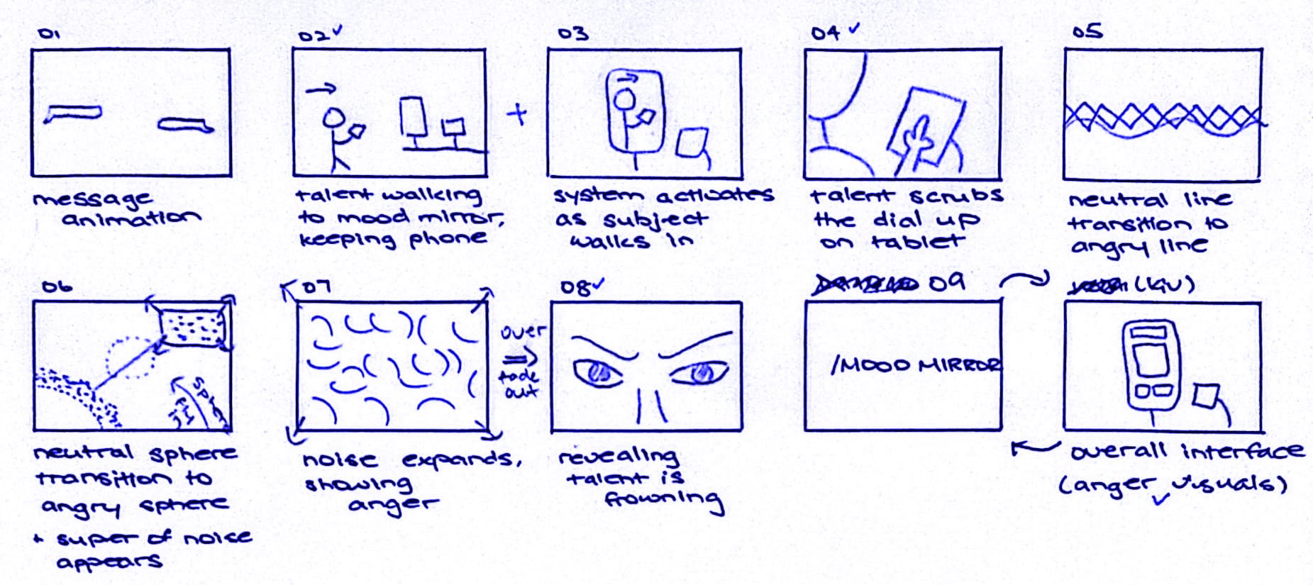
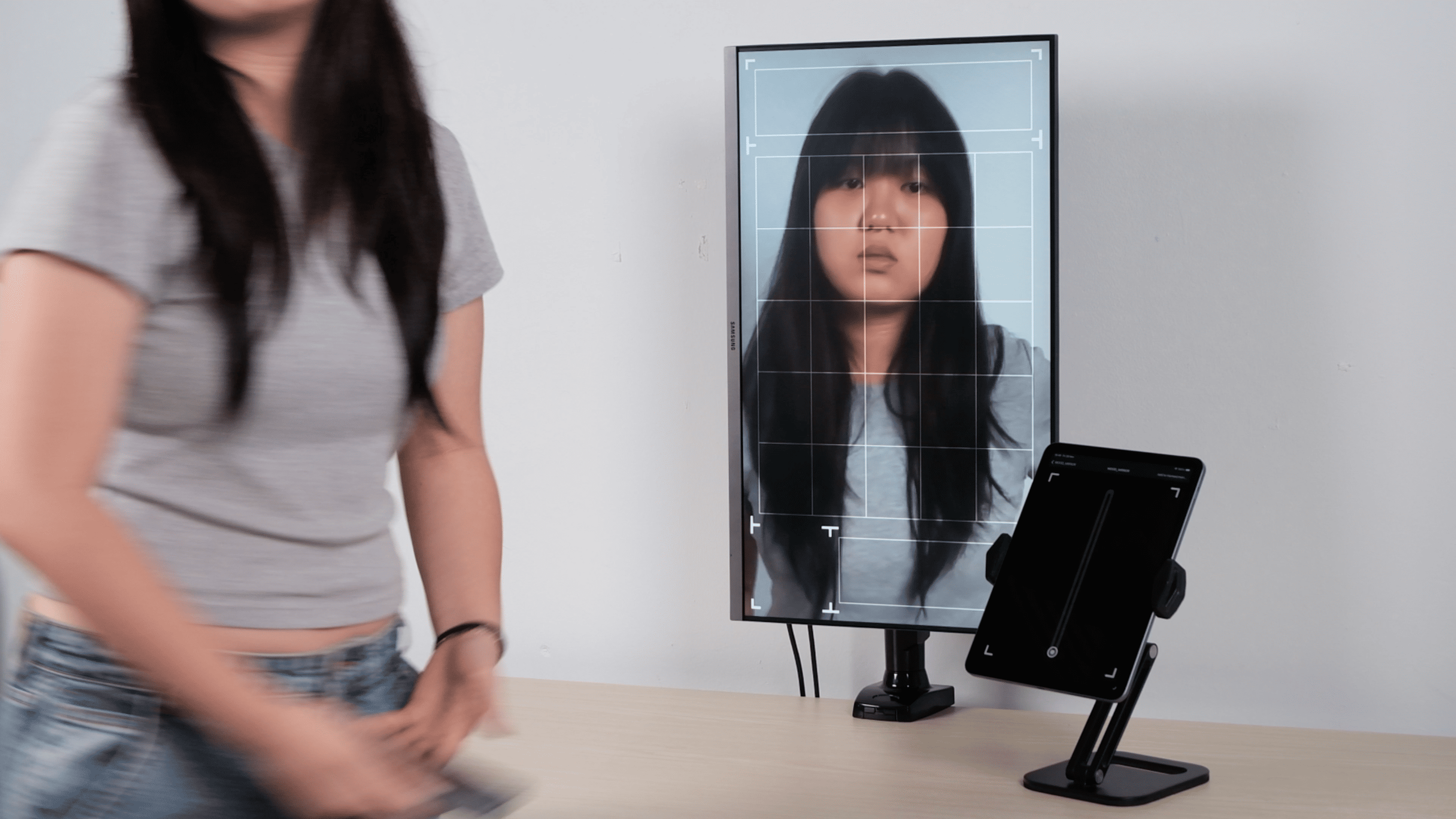
One major challenge I faced was setting up the prototype Mood Mirror. The interaction relies on my laptop’s built-in camera but I needed the laptop hidden so that the monitor could function as the ”mirror”. Without a separate camera input, I decided to pre-record the interaction and play the footage on the monitor. I then had my participant mimic the same movements to create the illusion of a live emotional-tracking system.
Thankfully, once the assets were ready, replacing the placeholders went smoothly!