FIRST PRESENTATION
Even though my topic is still quite broad, I was glad that the presentation went smoothly. Seeing nods from my classmates reassured me that they understood what I was trying to convey. After half of the class presented, I felt relieved to realise that I was not alone in not having fully scoped down my topic. Everyone was still figuring things out.
Andreas gave me two pieces of feedback that left me with plenty to think about.
The first one was about direction. What kind of approach am I taking for this project? Am I leaning towards something playful and experimental, or do I want to address a serious issue with tangible social impact?
The second was about the outcome. What form will my project take? Could it be screen-based, an interactive installation or something else entirely that pushes beyond conventional formats?
Although it feels a little early to think about the final outcome, both points were important to think about. At this point, all I know is that I want my work to be meaningful, where it invites people to interact, interpret and reflect. Whether that translates into something whimsical or something more heavy, I see this uncertainty as part of the process. Hopefully, I will be able to nail down my direction in the coming weeks.
One thing that stood out to me during this entire presentation was the need to think more critically about originality. For example, in my presentation, I shared my recent obsession with MediaPipe’s finger-tracking plugin in TouchDesigner, which lets me create an intangible interface in physical space to control visuals on screen. While I thought that was fascinating, Andreas pointed out how such interactivity has already become too common online. Even though the variations of outcomes are limitless, the interaction itself has become oversaturated and risks feeling generic.
This comment was eye-opening. It made me realise that if I want my project to stand out, I need to go beyond tools and gimmicks that are already familiar to audiences. When I saw many of my classmates are moving towards the direction of interactive exhibitions, I also noticed how easy it is to fall into predictable formats. That thought was both daunting and motivating, as it will encourage me to consider how I should step outside my comfort zone and rethink what form my project could take.
THE HARD QUESTION
Andreas encouraged me to explore more readings about emotional responses. Before looking into more sources, I had to unpack what the term actually meant. To my simplest understanding, an emotional response would mean how people react to a particular stimulus on a feeling level. But the more I thought about it, the more I realised how complex it is. What shapes an emotional response? I could look into areas such as emotional triggers, the spectrum of emotions, methods of measuring emotions and even how individuals regulate or suppress them. Suddenly, all these factors became daunting to me and I felt overwhelmed. This raised a deeper, uncomfortable question — Why does my topic even matter?
Before I allowed myself to spiral further, I found an article that helped me put things into perspective. In Affective Visualization Design: Leveraging the Emotional Impact of Data, the authors pointed out that traditional data visualisation is all about accuracy, clarity and efficiency. However, emotions are frequently neglected. They argued that incorporating affective elements into data visualisation improves engagement, motivation and reflection.
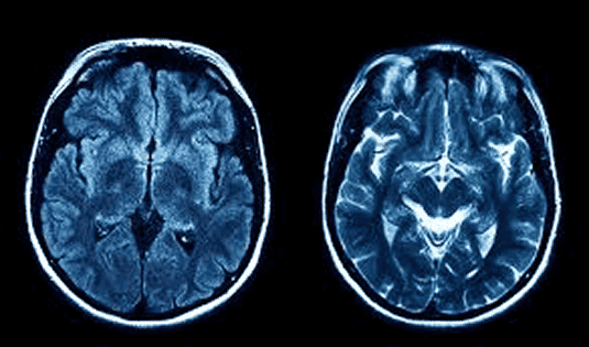

To ground this idea, I reflected on familiar examples like MRI scans or EKG readings. While these visual outputs provide crucial medical information, they are incomprehensible to me at first glance. I cannot tell whether the signals indicate something positive or negative, or in relation to my topic, they do not invite any emotional connection. They feel static, lacking any sense of narrative or empathy. This contrast helped me clarify why my project matters. Design has the potential to humanise such data, translating it into experiences that resonate emotionally and socially. With that, I was able to rationalise 3 key things —
➀ Emotion shapes perception. This project is not about simply turning data into visuals. It is about framing interpretation. The way colours, forms and motion carry emotional weight, shifting the meaning of the dataset entirely.
➁ Emotions make data tangible. Numbers and biometric signals are invisible. Emotions can be measured, but design expresses them and makes them perceptible.
➂ Emotional Engagement = Deeper connection. People remember experiences that resonate with them emotionally. Informational data becomes relational and reflective via design.
Therefore, I am not claiming biometric data is a precise measurement of emotion. I just want to treat it as raw affective material (signals of intensity, rhythm and presence), which I will translate into generative visuals as a form of visual storytelling.