FIRST GROUP CONSULTATION
This week’s consultation somewhat helped me clarify the direction of my project and Andreas reminded me to approach it with both focus and openness. He advised to organise my readings properly and refine my three key pillars —
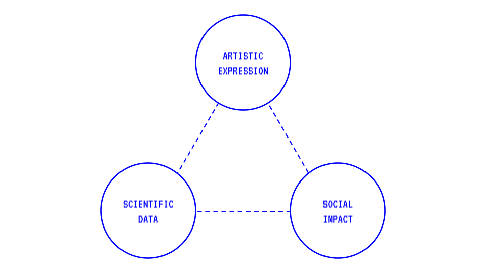
① Scientific Data grounds my research in biometric signals
② Artistic Expression allows me to explore abstract visual interpretations of emotions
③ Social Impact/Empathy pushes me to consider how design can foster understanding between people.
One important takeaway was to separate the technical from the visual in the early stages. Andreas advised me to explore biometric data and visualisation separately but at the same time. I assume that I can experiment with low-tech methods of capturing data on one hand and develop visual explorations of emotions without live data on the other. This approach may give me space to refine my visual language before integrating it with biometric inputs.
We also discussed the correlation of context and interaction, if I was still working towards an exhibition for my outcome. Andreas questioned how are the participants going to emote differently? This was an interesting question for me to think about because it is more likely that the audience will be at a neutral state and everyone’s outcome might appear the same. Would I need additional visual or auditory stimuli to provoke emotional responses?
Finally, the conversation on social impact encouraged me to think about what it means to forge empathy through design. Could visualising someone’s emotions be an extension of them? Could it allow two people to understand each other without words? These questions got me thinking about my next experiment.
EXPERIMENT 002
For my second experiment, I wanted to explore the idea of how ‘aura’ can be a visual representation of emotions.
According to Goggle, an aura is a distinctive emanation surrounding the body of a living creature and regarded as an essential part of the individual. I interpret this as the invisible trace of one’s life force. It is a form of energy that exists in everyone and could potentially shift in response to emotional states. My goal was to visualise this life essence being emitted from someone’s body and imagine how it might look under different emotions.
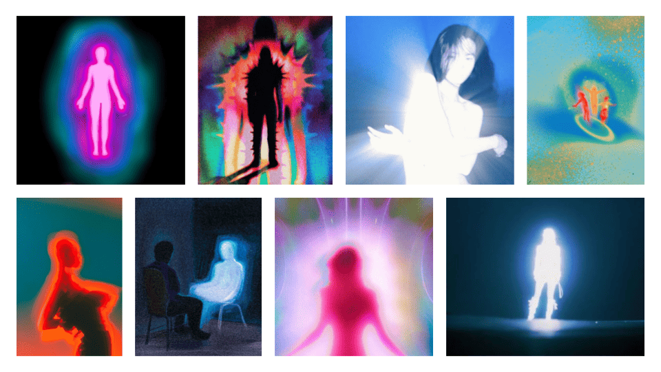
Using my moodboard as a visual reference, I wanted to experiment how coloured emissions will respond and trail movement. I developed the effect in TouchDesigner with MediaPipe’s Image Segmentation operator to isolate the subject from the background. I applied a Feedback TOP operator to the background to generate a trailing, motion blur effect. The subject remained clean above the blurring layer.
It took me a while to achieve the visual of the aura. At some point, I looked like I was on fire. Eventually, I settled on my latest iteration and added an editable interface that allows users to adjust their aura colours and control the emission intensity. This interactive layer became central to the experiment such that participants could select colours that represented their current emotional state. I also prepared a list of emotions for them to recall a specific memory/emotion. After the activity, I asked them 3 questions —
① What are your thoughts on your emotions being read?
② Did your personal interests in other colours affect your decision?
③ Why did you choose that colour?
Charlene is thrilled!
① "If I am aware and I give my consent, that’s ok."
② "Yes, it affected my decision-making."
③ "I didn’t choose yellow because it fits for happiness and it’s a mild feeling as compared to pink, which is vibrant and suitable for an intense emotion like thrilled."
Ethel is yearning for her bed!
① "It can be seen as both an invasion of privacy and a tool to understand people better."
② "I saw some of the colours I liked but it didn’t suit the emotion, so it did affect my decision."
③ "Green represents comfort and I am strongly missing my comfortable bed."
Jennifer is happy!
① "I would feel exposed. But while I do like to keep my emotions to myself, I sometimes hope someone will reach out to me when I am down."
② "Yes, it affected my decision-making process."
③ "I associate yellow with happiness because it’s a common colour representation for it."
Jeremy is worried!
① "It’s scary because I can’t hide my emotions."
② "It didn’t affect my decision-making process."
③ "I associate this colour with this emotion because it is culturally associated."
Rene is excited to shit!
① "It’s scary because I feel vulnerable. It could be seen positively if I am sad and people approach me to talk about it. I also think it could make people more honest with their emotions."
② "It didn’t affect me."
③ "I am excited to shit. I feel strongly about it because it’s my favourite past-time and I pick brown because that’s the colour of shit."
Sanna is uneasy!
① "It depends on who is reading. I don’t like being read. I think it can be nice only for positive emotions like happiness."
② "The colour spectrum was pretty random and it was hard to select. But it didn’t affect my process."
③ "I typically associate purple/blue for fear/sadness and it’s quite common, seeing examples outside.
Through this experiment, it is revealed how diverse and personal colour-emotion associations can be. While some participants relied on cultural conventions, others chose based on humour or personal memory. What stood out was how participants viewed the act of being read as a concern of privacy, but also acknowledged that it could foster connection if handled with care.
For me, aura visualisation is more than an aesthetic layer. It carries the potential to expose untold stories. The aura becomes a visible cue that invites curiosity about someone’s inner state. At the same time, I began to question whether I should conform to widely recognised colour-emotion pairings for clarity or explore new forms of expression but risk not being easily understood.