FIRST INDIVIDUAL CONSULTATION
Before meeting Andreas, I was reading Affective Computing by Kristina Höök. I stumbled upon an important distinction between ‘Affective Computing’ and ‘Affective Interaction’.
Affective Computing refers to systems and devices designed to recognise and respond to human emotions. In this approach, emotions are simplified into measurable variables for the system to act on. What does this mean?
For example, I am using an online learning platform with a webcam. The system notices that I look tired. It classifies my current emotional state as ‘boredom’ and automatically suggests a short break. This shows that my emotion is objectified and processed as a variable for decision-making.
Affective Interaction is less about recognition and more about experience. It is concerned with designing interactions where emotion emerges naturally from the ongoing exchange between user and system. What does this mean?
For example, a kid is playing with an interactive art installation. As he waves his hands, the visuals and sounds shift, creating a calming or chaotic atmosphere. He becomes curious, then maybe playful. The system keeps adapting, deepening the mood and experience. This shows that emotions co-created the experience with the system.
I became stumped after reading the article and was completely unsure where I wanted this project to go. I shared my uncertainty with Andreas and he clarified my thinking by sketching a simple flow diagram —
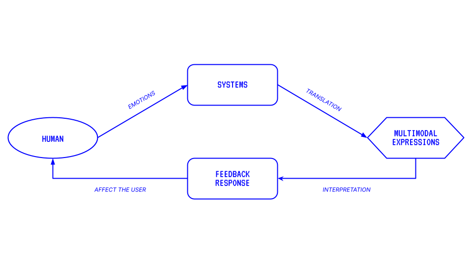
In this diagram, emotions are quantified into data through a system and translated into multimodal expressions (visuals, sound etc). These expressions are interpreted by the audience. This interpretation could influence or shift the audience’s emotional state, feeding back into the system. This made me realise that my envisioned project does not fit into one category but it is a blend of both ‘affective computing’ and ‘affective interaction’. The system relies on recognition (affective computing) but there is the reflective feedback loop that reshapes the human experience (affective interaction). This insight gave me a firmer understanding and clearer direction moving forward.
FINDING A PURPOSE
With this clarification, Andreas pointed out that this system creates an opportunity to act as a tool for emotional regulation. However, he then asked me to reflect on why regulating emotions might be necessary.
To me, emotions are what it means to be human. Emotions shape how we experience the world, influence our decisions and form the basis of our relationships with others. However, emotions can also overwhelm us and impair our ability to think clearly. For example, anger if left unchecked might escalate into violence, creating unsafe situations for those involved and/or nearby. While this may sound like an extreme case, it illustrates why regulating emotions could have value. A system that helps mitigate emotional states has the potential to foster safer, more thoughtful interactions.
If I am moving towards emotional regulation, my aim is not to suppress or erase emotions but to guide them toward more constructive expressions. If my project can translate emotional data into aesthetic indicators, encourage reflection or calmness, its purpose extends beyond art or spectacle. It definitely can become a tool for empathy and well-being.
EXPERIMENT 003
For my third experiment, I wanted to play on the idea of revealing hidden emotions and explore how visual language can be used to express different emotions. I have always felt that facial expressions can sometimes act as facades, masking what a person is truly feeling. Therefore, I began to search for tactile materials that could expose hidden elements.
A Polariser Filter is an optical filter that allows only certain light waves to pass through. In photography, it reduces unwanted reflections and glare, making colours appear more saturated.
I came across The Art of Polage '67 by Austine Wood Comarow, whom layered and collaged handcut cellophane to create artworks that can only be fully distinguished by polarisers. What intrigued me most was how colours only began to emerge on the cellophane when the filter was rotated to a specific angle.
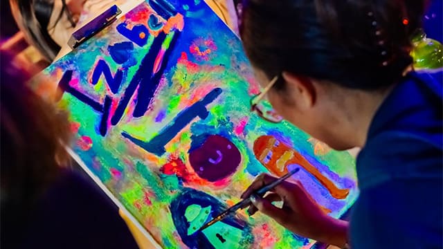
Neon Paint contains fluorescent pigments that glow under ultraviolet light. These pigments absorb ultraviolet radiation, causing electrons in the pigment molecules to react. As they return to their original, lower-energy state, they release the absorbed energy as visible light which we perceive as a bright, glowing colour.
Neon paint is often used in workshops, such as local Neon Art Jam SCURO in Singapore. While these neon artworks are visually striking, I noticed that not all colours are equally effective under ultraviolet light. For instance, blue and purple neon paints do not appear very effective compared to other colours.
Between the two materials, I decided to work with neon paint because it was more accessible. I bought red, blue and yellow neon paints to represent anger, sadness and happiness respectively. I also managed to find an ultraviolet torch from a neighbourhood departmental store.

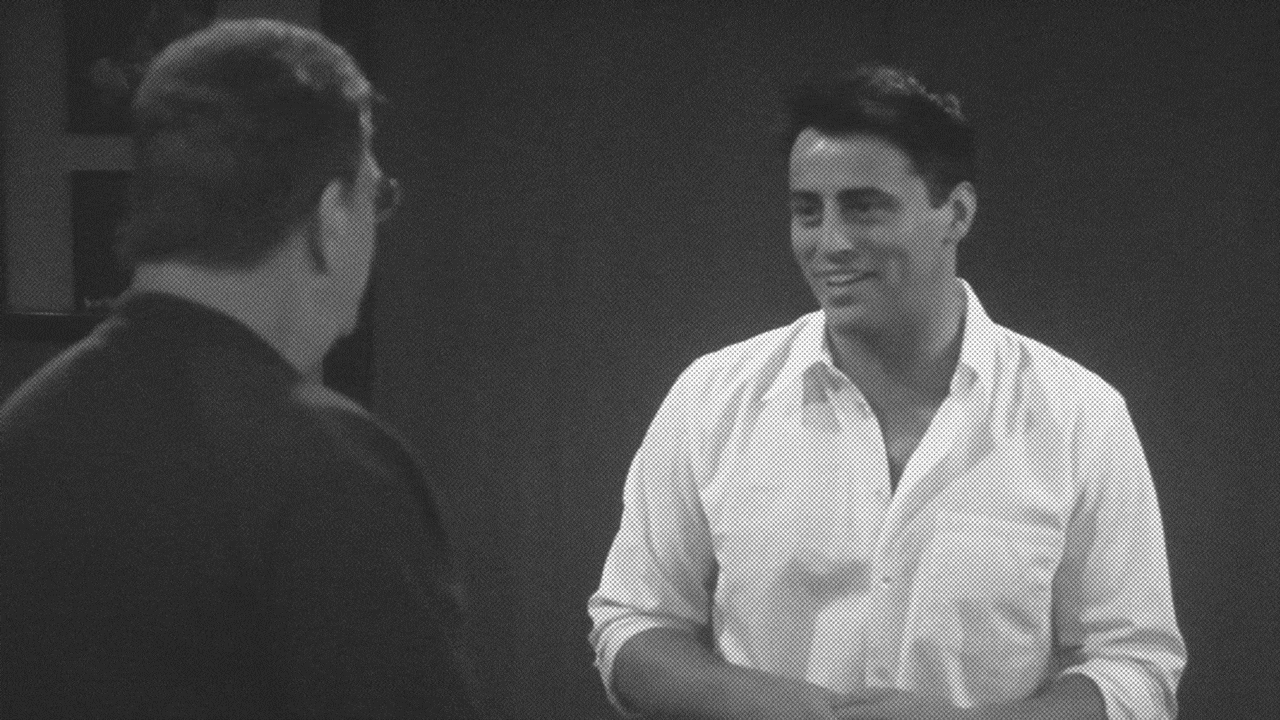
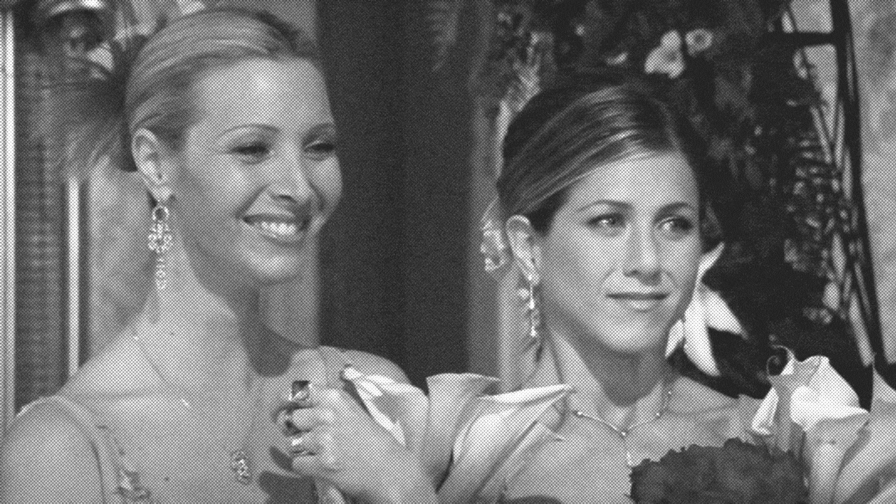
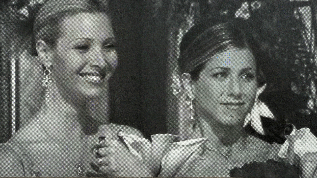
My idea was to use three characters from the sitcom Friends, each depicting a distinct expression. I will paint their face with a colour each that will reveal their current emotional states and participants will have to guess their emotion. The characters’ emotion will be revealed on the other side of the printed still.
However, I realised that the pigment was very strong. Even without the ultraviolet light, the colours were already visible, making this experiment ineffective. To fix this, I diluted the colours with glow-in-the-dark paint. While this softened the tones in its dry state, the multiple paint layers left the characters looking more like glowing zombies and the red and blue neon colours did not stand out.
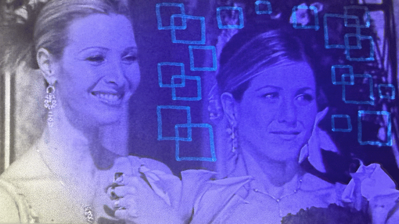
To salvage the experiment, I ordered invisible ink pens from Shoppee and I was glad they arrived the next day. However, the limitation was that the ink only glowed in one colour. To differentiate the three emotions, I relied on shapes and lines.
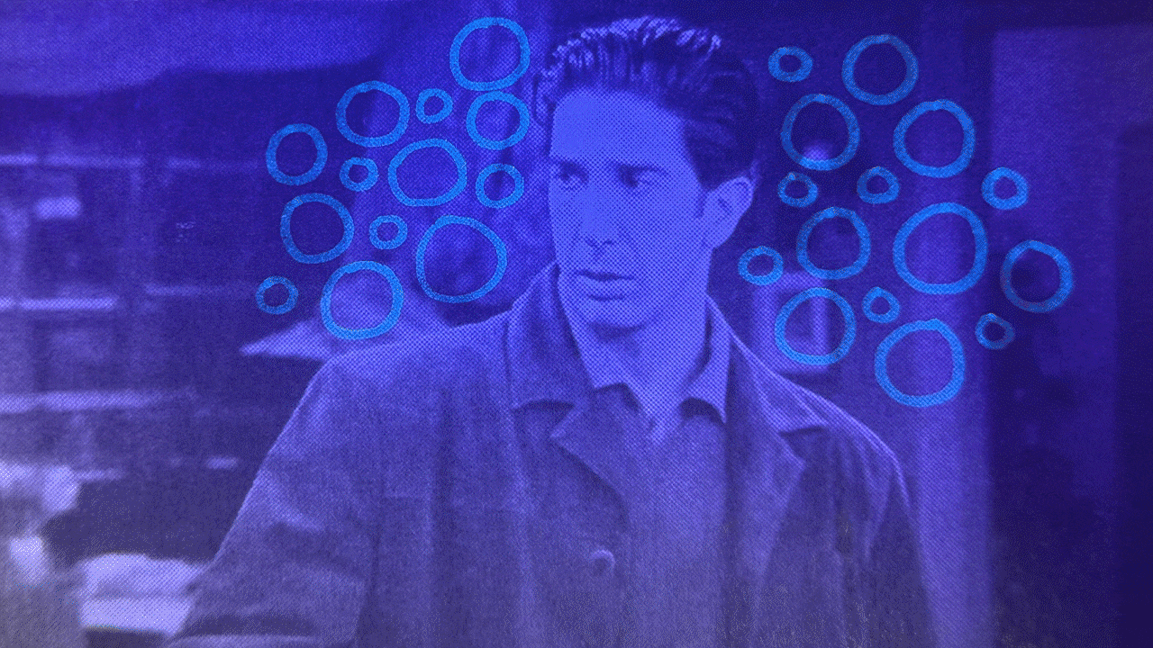
Use of Circles — Circles have no sharp edges. This softness conveys comfort and playfulness, which connects to the bubbly, uplifting nature of happiness.
Use of Ray Lines — Lines radiating outward resembling sunshine or bursts of energy. They communicate warmth and brightness, symbolic of how happiness spreads and uplifts.
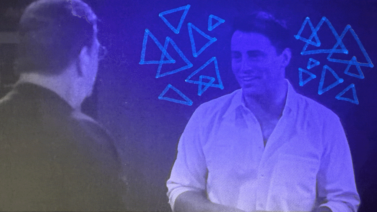
Use of Triangles — Triangles have sharp, pointed edges and a sense of instability when placed on a single tip. This sharpness reflects the volatility of anger, which can feel piercing or explosive.
Use of Criss-Cross — Criss-cross is essentially made of overlapping lines, which suggest collision and friction. This creates visual tension and clashing of energy.
Use of Downward Lines — Vertical strokes resemble rainfall or tears. The descent visually represents heaviness and gloom. The visual downward pull best represents the drag of the sad emotion.
Use of Ray Lines — Lines radiating outward resembling sunshine or bursts of energy. They communicate warmth and brightness, symbolic of how happiness spreads and uplifts.
While these visual metaphors were somewhat effective, I found them less immediate than colours. Shapes and lines can suggest qualities of emotions, but their interpretations are more abstract. I fear that shapes and lines are very limited to associate with the long list of emotions. For example, mapping emotions onto polygons with increasing sides (pentagon, hexagon, heptagon etc) could be possible in theory but it would be impractical for users to decode immediately. This experiment made me realise the importance of colour as a direct and intuitive way of representing emotion.
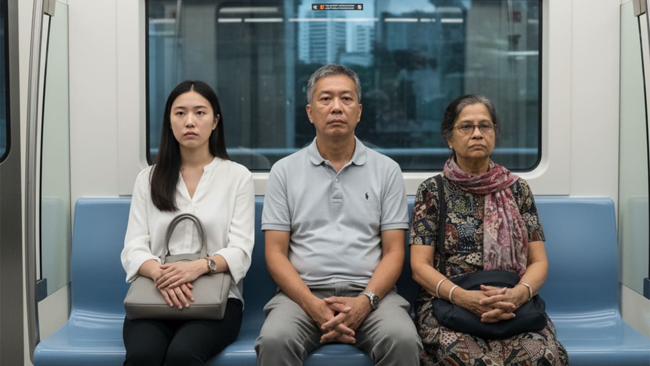
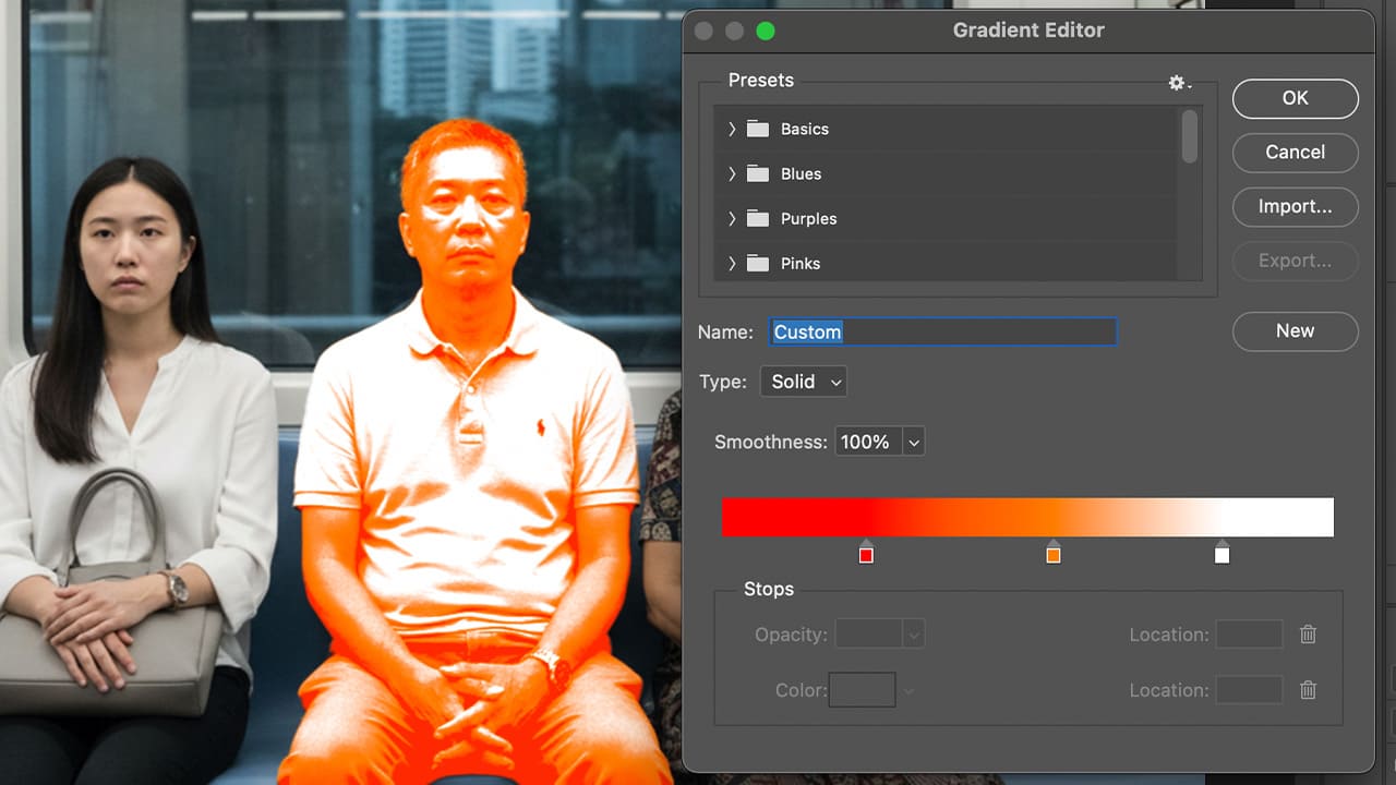
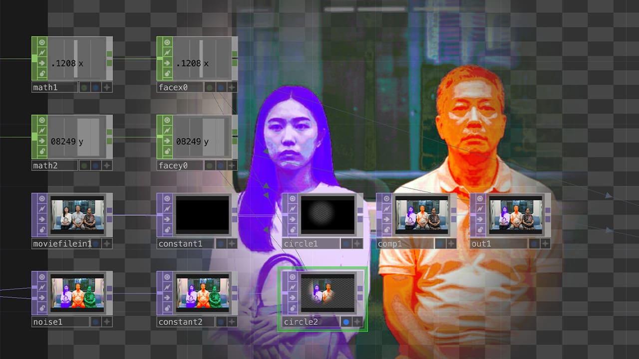
To extend the idea, I decided to replicate the concept digitally onTouchDesigner. Since I did not want to photograph real commuters, I generated an image of three expressionless MRT passengers. I then applied gradient maps to symbolise different emotional states in Photoshop. In TouchDesigner, I layered the original image over the edited image and used the Facial Tracking operator to gradually reveal the hidden emotions.
This digital replication felt more effective than the physical experiment. The use of colour gradients was immediately comprehensible and gave the portraits a subtle narrative, inviting viewers to wonder why the passengers are feeling as such.
Through this experiment, I learnt how different visual languages shape the effectiveness of emotional expression. Colours remain the most direct and impactful for mapping emotions, while shapes and lines seem too limited for conveying a wide emotional range. This reflection reminded me that aesthetics are not just decorative but they deeply affect interpretation and user experience.