FIRST RPO DRAFT
This week, we prepared our first draft of the Research Proposal Outline (RPO) and exchanged feedback with our classmates. Not going to lie, reading through pages and pages of outlines early in the morning and trying to squeeze my brain dry for constructive feedback was mentally draining. That said, I noticed the range of writing styles across my peers. Some drafts were engaging and well-structured and I found those particularly enjoyable to read. These will serve as inspiration for me to refine my own writing so that it feels less rigid and more comprehensive.
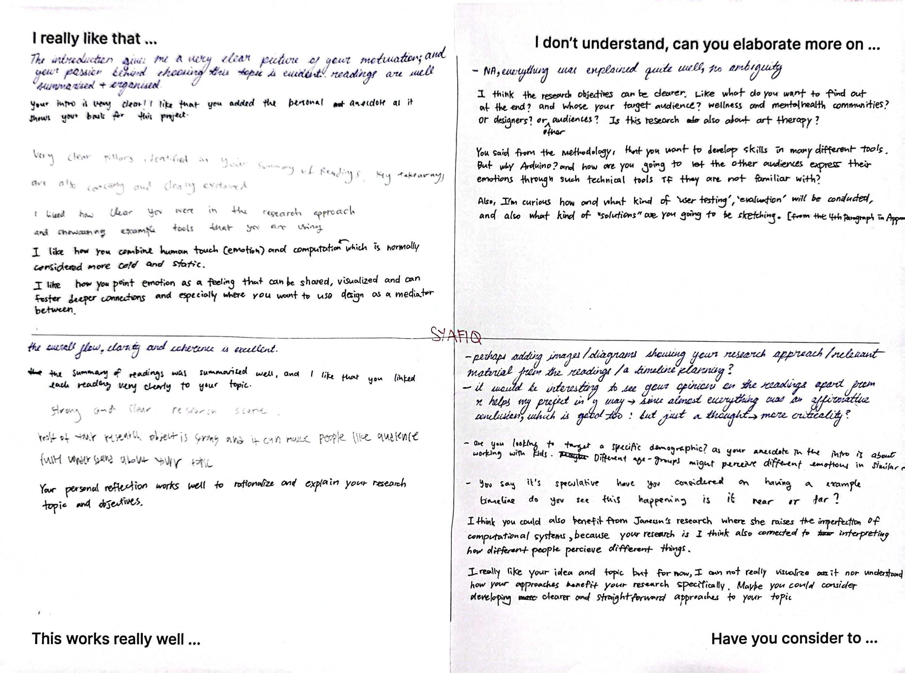
At the same time, they raised some important concerns. My research objective was seen as too vague, with uncertainty around what I ultimately want to discover and who the project is intended to benefit. Is the focus on wellness communities, designers, children or the general public? This lack of audience definition makes the objectives feel broad and unfocused. Another concern was my plan to integrate physical computing tools like Arduino, which may feel inaccessible or irrelevant for general audiences unless I clearly justify their role. Lastly, they suggested that instead of simply affirming the readings in my summary, I should also include my own critique or perspective to demonstrate deeper engagement with the texts.
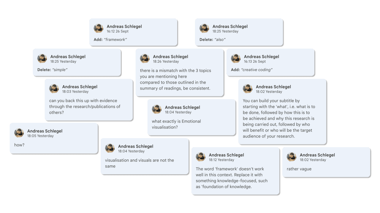
Andreas’ feedback was built on this by emphasising rigour, precision and consistency. He flagged my use of vague terminology like “emotional visualisation”, “visuals” and “generative visuals”, urging me to refine and standardise the language across my proposal. I was reminded that the outline should be written as though the reader has no prior understanding of my research; every key term needs to be explained clearly and consistently. Andreas also pointed out that I need to support my claims with stronger evidence, drawing from citations, models or studies from the readings. Finally, he suggested refining my three research pillars by removing any readings that are not directly relevant or supportive, in order to strengthen the focus of the proposal.
Reflecting on all this feedback, I realised that my two main priorities moving forward are to refine my Summary of Readings and to sharpen my Research Objective. Both are crucial to making my proposal coherent and convincing. In addition, I want to improve my overall writing style so that readers can easily grasp the “big idea” of the project without stumbling over unclear terms or vague phrasing. Although the feedback felt overwhelming, it has given me a clearer roadmap of what to prioritise as I work on the next draft.
EXPERIMENT 004
Although I mentioned that “facial expressions can sometimes mask what a person is truly feeling” in the previous experiment, I wanted to explore the integration of facial expressions as a trigger to change visuals appearing on screens. Below is the flow diagram of the system I intend to create on TouchDesigner —
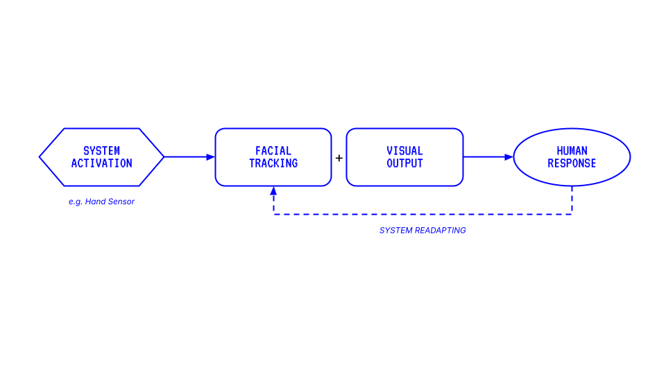
Initially, I considered using Arduino together with a Grove PIR Motion sensor to activate the visuals. The PIR sensor can detect object motion up to three meters, which would have served as an interesting physical trigger. However, I did not have access to an Arduino at the time I developed this idea. Instead, I turned to MediaPipe’s hand tracking operator as an alternative. This became a speculative gesture — imagining how hand scanning could serve as an interface for activating emotion-recognition systems. In other words, I wanted to introduce a touch of “science fiction flair” into the interaction, making it feel slightly futuristic and uncanny.
![]()
![]()
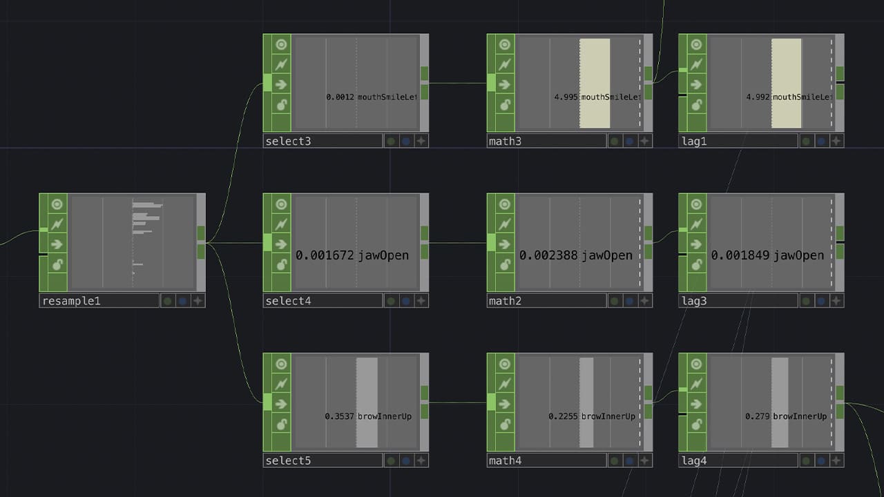
Once I began setting up the system, I focused on working with the facial tracking operator. This allowed me to resample and isolate different types of facial data. For this experiment, I used three parameters:
① ‘mouthSmileLeft’ to measure the width of a smile
② ‘jawOpen’ to measure the openness of the mouth (smiling with teeth)
③ ‘browInnerUp’ to capture the height of raised browns (frowning)
Since these values are tracked up to several decimal points, I had to normalise and map the data between 0 and 1 (or other whole numbers) to make them more manageable and consistent for the visuals.
For the visual, I experimented with a video recording of myself. The concept was simple: turning myself yellow when I smile and red when I frown. Drawing from the ‘Circumplex Model of Emotion’, I attempted to distort the video to represent the high arousal of these emotions. However, the outcome was far from successful. The distorted face was jarring and unaesthetically pleasing. It distracts from the concept rather than enhancing it.
This led me to restrategise: what if I distorted shapes instead? Shapes offer abstraction and abstraction can sometimes communicate emotion more effectively without the baggage of literal representation.
I shifted towards using TouchDesigner’s new POPs operator to create a sphere with applied noise distortion. To me, a sphere has a universal, life-like shape. Much like Earth, the sphere felt like an appropriate form to represent us. Rendered with a line material to evoke a biometric or data-driven aesthetic, the biometric sphere became my new canvas. The emotional mappings were set up as follows;
① ‘mouthSmileLeft’ changed the sphere from white to yellow
② ‘jawOpen’ increased the amplitude of the noise distortion
① ‘browInnerUp’ changed the sphere from white to red while also reducing the period of the noise distortion
② ‘jawOpen’ continued to increase distortion amplitude
Together, these combinations created shifting, dynamic visuals that abstractly represented ‘happiness’ and ‘anger’ without being too literal. From this experiment, I have realised the value of abstraction in affective interaction. The sphere felt like a more open-ended and poetic medium compared to using my own face. Moving forward, I am excited to test more expressions and variables to discover the wide range of visual possibilities this system can produce.